Ready to begin your studio journey?
Launch your studio with a free trial of OfferingTree and start your journey off right. Build your website, offer classes, take payments, and so much more!
This article is based on insights from Mado Hesselink, host of the Yoga Teacher Resource podcast and founder of The Impact Club, shared in a recent OfferingTree webinar on how to build homepages that actually work to boost sales for your business.
The top section of your homepage has one humble job: get people not to click away within two seconds of landing on your site. That might sound dramatic, but think about your own browsing habits. How many websites have you visited and immediately closed because something felt off? The design was cluttered, the message was unclear, or it just didn’t feel like it was for you? That’s exactly why fitness studio websites need to focus on clarity and trust more than flashy features.
The good news? You don’t need to be a web design expert to create a compelling homepage. You just need to get a few key things right. These fitness studio website tips apply whether you run a yoga studio, pilates space, or boutique gym.
Start With Three Foundations: Fitness Studio Website Tips That Matter Most
Before you open your website builder, Mado recommends getting crystal clear on three things. These are the fitness studio website tips that separate sites that convert from sites that collect dust.
1. Your Target Market
Who do you serve? This isn’t about turning people away. It’s about speaking clearly to someone specific.
When you try to speak to everyone, you end up speaking in generalities, and “that is the quickest way to be super boring,” Mado explains.
This doesn’t mean that you’ll turn away folks who don’t fit this description, just that you aren’t trying to be everything to everyone.
Your target market could be:
- A life phase or identity (empty nesters, corporate executives, former athletes)
- A problem and solution (people who have been told to exercise by their healthcare providers, but feel intimidated, people who need to exercise at odd hours, folks who want a body positive environment)
- An actual person you know (your favorite student or client)
The more specific you are, the more your copy comes alive. People who resonate with your message will feel seen. Those who don’t will simply move on, which is actually helpful for everyone.

2. Your Tagline or Core Message
This is where many wellness professionals get stuck. Your tagline should be simple, clear, controversial, and positive.
Wait, controversial?
Mado isn’t suggesting you start arguments. But if nobody could disagree with your tagline, it’s probably too generic. Consider these examples she shared:
- “Your to-do list won’t miss you. Your body will.”
- “No toxic positivity here. Just real peace.”
- “Health isn’t a look, it’s a feeling.”
Each statement takes a stand. Each could spark a debate. And that’s exactly the point. Thought leadership builds trust. When you’re willing to say something real, people who align with your values immediately feel like they can trust you. This is one of the most overlooked fitness studio website tips: your tagline should make some people say “yes, that’s me” and others shrug and move on.
3. Your Core Offerings
What do you want people to do on your website? What are you trying to sell? Focus on offerings that are either easy for people to say yes to or most lucrative for your business. Ideally both.
Getting clear on these three foundations will save you hours of indecision when you’re actually building your site.
The Three Essential Homepage Elements (Core Fitness Studio Website Tips)
According to Mado, only three things are truly essential on your homepage: a hero section, your offerings, and a call to action. Everything else is optional. This is one of the most practical fitness studio website tips you’ll hear: start simple.
The Hero Section
This is the first thing visitors see. It should include:
- A striking image (ideally of you if you are the face of your business, but high-quality is key)
- Your tagline or core message
- A call to action
Remember: in the hero’s journey, your client is the hero. You’re the guide. Your hero section should make your ideal client feel seen and understood immediately.
Your Offerings
Make it clear what you provide and who it’s for. Don’t bury this information three clicks deep. Remember: each time a click is required to move on, you’ll lose people. Put your most important offerings front and center.
A Call to Action
A powerful call to action is clear, offers something people want, and is easy to receive or implement. Examples include:
- “Get a free movement assessment”
- “30 days unlimited yoga for $50”
- “Download your self-compassion toolkit”
The button text should make it clear what happens next. “Learn more” is vague. “Send me my practices” or “Start my free trial” tells people exactly what to expect.

Design Principles That Build Trust
Beyond content, certain design choices make your website feel more professional and trustworthy. These fitness studio website tips apply no matter what platform you’re using:
Use hierarchy. Organize content in order of importance. What’s most crucial goes at the top.
Make it easy to skim. Use headers, subheaders, and bullet points. Break up text with images or color changes. Nobody wants to read long blocks of text online.
Be generous with white space. Give your content room to breathe. White space helps brains relax and prevents overwhelm.
Don’t fear repetition. If something is important, say it multiple times in different ways. Most people are skimming, so they might miss it the first time.
Common Fitness Studio Website Mistakes to Avoid
Mado also shared mistakes that erode trust and send people clicking away:
Confusing navigation. Visitors should always know where a link will take them. No surprises.
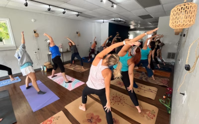
Generic stock photos. Generic stock photos. Those free stock photo sites? Everyone uses them, and your visitors can tell. If you need to use stock photos temporarily, plan to replace them with custom photos of you and your clients. Real faces build trust.
Too much text. Mado recommends never having more than a paragraph of text without breaking it up somehow. If you find yourself with large blocks of text, add headers, images, change background colors, or split the content into multiple sections.
Text over busy images. If you must put text over an image, make sure the image is simple or use an overlay. Better yet: give images their own space and surround your text with white space.
Vague calls to action. Always ask yourself: Is it clear what I’m asking people to do?
Avoiding these mistakes is just as important as following the fitness studio website tips above. Sometimes what you leave out matters more than what you put in.
What to Leave Out
“Anything that doesn’t have a purpose on your website is detracting from everything that does have a purpose,” Mado emphasizes.
If you’re not sure why something is there, leave it out. You can always add it back later once you’ve figured out its purpose.
Specifically avoid:
- Platitudes and obvious statements (like “we’re all one”)
- Too much detail about your process (save that for after they’ve booked)
- Content with no clear purpose
Less is more. A small, tight, professional website is better than a large, chaotic one.
Make Your Website a Habit, Not a Chore
Here’s Mado’s final piece of wisdom, and it might be the most practical of all these fitness studio website tips: don’t try to build your entire website in an eight-hour marathon session. Instead, touch your website for 20-30 minutes a week. Mado calls this approach “frequency beats intensity.” It has several benefits:
- You’ll stay up to date without burning out
- You’ll get faster at making updates
- You can add features gradually as you grow
- You won’t avoid your website for months at a time
Start with the essentials: hero section, offerings, and call to action. Then add other elements as you go: an about section, testimonials, a gallery, featured offers, or even fun facts about yourself that show you’re a real person.
Remember: websites today are incredibly powerful tools, and you don’t need to be a professional to create something compelling. Apply these fitness studio website tips one at a time, start with a clear foundation, and build consistently.

Ready to Put These Fitness Studio Website Tips Into Action?
If you’re looking for a fitness studio website builder designed specifically for wellness professionals, OfferingTree was built specifically with Mado’s principles in mind. It makes creating a compelling homepage simple, even if tech isn’t your thing.
- Pre-Built Hero Sections: Our templates come with customizable hero sections designed to showcase your image, tagline, and call to action. No need to figure out the layout from scratch.
- Integrated Booking & Scheduling: Unlike generic website builders, your offerings aren’t just static text. They’re connected directly to your booking system. When someone clicks “Book a Class” or “Start Your Free Trial,” they can complete the action without leaving your site.
- Built-in Call-to-Action Tools: Create powerful CTAs that actually convert. Whether you’re offering “5 Free Power Yoga Sessions” or “30 Days Unlimited for $50,” the platform handles the signup, payment, and scheduling automatically.
Features Designed for Fitness Professionals
- Class & Workshop Management: Schedule recurring classes, workshops, and private sessions—all managed from one dashboard
- Integrated Payment Processing: Accept payments, sell packages, and offer memberships without third-party plugins
- Client Management: Track attendance, manage waitlists, and communicate with your community
- Mobile Optimization: Your homepage automatically looks professional on any device—no separate mobile design needed
Why OfferingTree Is the Fitness Studio Website Builder of Choice
Generic platforms like Wix or Squarespace require you to cobble together multiple plugins for booking, payments, and client management. With a purpose-built fitness studio website builder like OfferingTree, these features work together from day one:
- No plugin conflicts: Everything is built to work together
- Wellness-specific templates: Designs created for yoga teachers, pilates instructors, personal trainers, and holistic practitioners
- All-in-one platform: Website, booking, payments, and client management in one place. No monthly fees for multiple services
- Built by wellness professionals: The platform understands your needs because it was created for your industry
This means you can follow Mado’s advice to “touch your website for 20-30 minutes a week” without getting bogged down in technical troubleshooting. Update your offerings, adjust your messaging, or add new features. No code. No juggling multiple platforms.
Start with the foundations, keep it simple, and remember: your website is never truly finished. It’s a living representation of your work that grows and evolves as you do.
Need inspiration? Check out these example websites created with OfferingTree.
Want to dive deeper into website strategy? Check out Mado’s Yoga Teacher Resource podcast or learn more about The Impact Club for ongoing support.
Frequently Asked Questions:
Fitness Studio Website Tips

What makes a good homepage for a fitness studio?
A good fitness studio homepage needs three essential elements: a hero section with a striking image and clear tagline, your core offerings displayed prominently, and a strong call to action. Your homepage should immediately make your ideal client feel seen by speaking to a specific target market whether that’s menopausal women, athletes, or people with back pain. The design should use hierarchy, be easy to skim, and include generous white space. Most importantly, your homepage should clearly communicate who you serve and what you’re asking them to do next, whether that’s booking a class, downloading a free resource, or starting a trial.
How long should my fitness studio homepage be?
Your wellness homepage should prioritize clarity over length. According to Mado Hesselink, you only need three essential sections: a hero section, your offerings, and a call to action. Everything else is optional. The key is to avoid large blocks of text. Never use more than a paragraph without breaking it up with images, color changes, or section breaks. Focus on making content easy to skim with headers, subheaders, and bullet points. A small, tight, professional website is better than a large, chaotic one. Start with the essentials and add other elements like testimonials, galleries, or an about section gradually over time.
Do I need professional photos for my fitness website?
While high-quality images are essential for building trust, you don’t necessarily need to hire a professional photographer immediately. However, you should avoid generic stock photos from free sites. Everyone uses them, and they erode trust. If you must use stock photos temporarily, plan to replace them with real photos of you and your clients as soon as possible. Real faces build trust. For your hero section, an image of you is ideal, but quality matters more than perfection. The photo should be striking and make your ideal client feel like your website is for them.
What should I put on my fitness website?
Start with three essential elements: a hero section (with your image, tagline, and call to action), your offerings (classes, workshops, or programs you want to sell), and a clear call to action. Before building, get clear on your target market, your core message or tagline (something controversial and positive that takes a stand), and which offerings are either easy for people to say yes to or most lucrative for your business. From there, you can add optional elements like an about section, testimonials, a gallery, featured offers, or fun facts that humanize you. Remember: anything without a clear purpose detracts from everything that does have purpose, so leave it out until you know why it should be there.
What's the best fitness studio website builder?
The best fitness studio website builder depends on your needs, but look for one that integrates booking, payments, and client management in one place. Generic builders like Wix or Squarespace require plugins that don’t always play nice together. A purpose-built platform like OfferingTree combines your website with scheduling, payments, and marketing tools, so everything works together from day one.